mainPlot <- ggplot()
rightPlot <- ggplot()
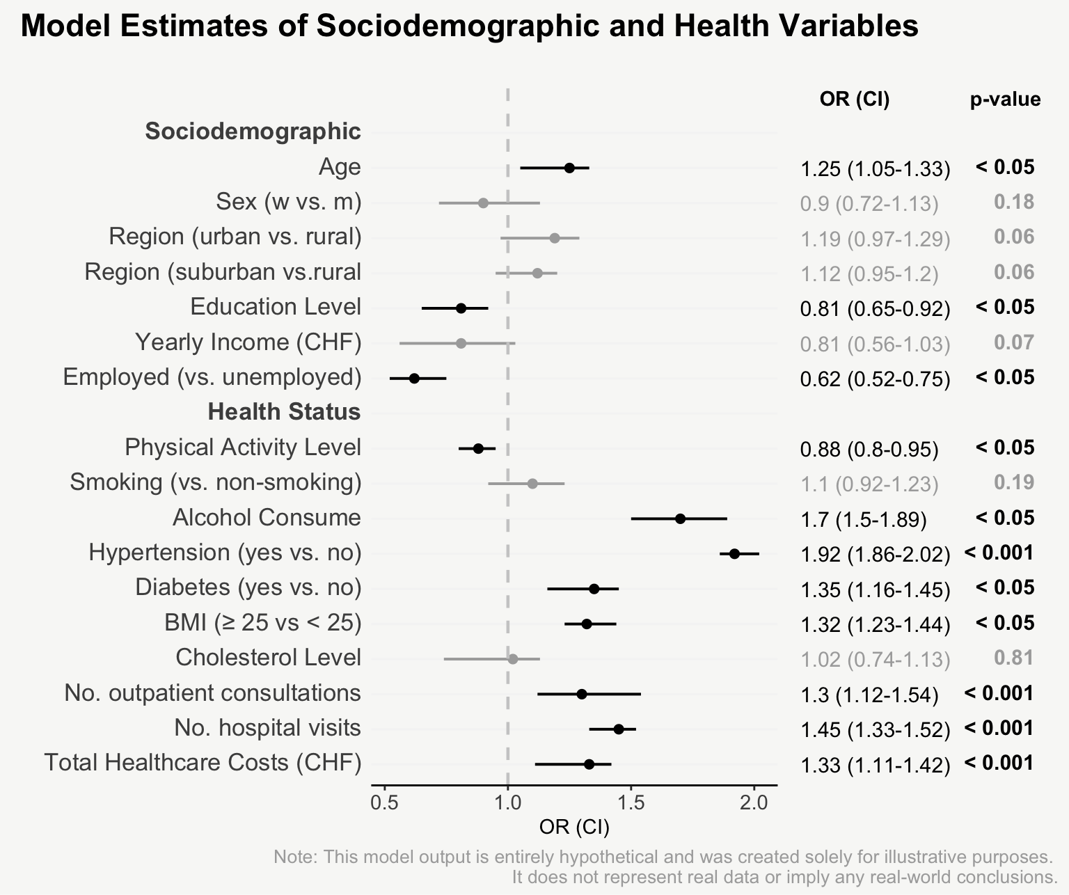
mainPlot + rightPlot + plot_layout(widths = c(1.8,1.2))From Boring Tables to Beautiful Plots
For presenting model estimates (e.g., odds ratios and confidence intervals with corresponding p-values) in reports or publications, I find figures are far more helpful than tables.
The following post shows how to transform a model output into a nicely designed plot, step by step. The example is based on a hypothetical model output that includes odds ratios of sociodemographic and health variables on some binary outcome.
| Model Estimates of Sociodemographic and Health Variables |
||||
| Odds Ratios (OR), Confidence Intervals (CI), p-values | ||||
| variable | OR | CI_lower | CI_upper | p_value |
|---|---|---|---|---|
| age | 1.25 | 1.05 | 1.33 | 0.01100 |
| sex_w_vs_m | 0.90 | 0.72 | 1.13 | 0.18000 |
| region_urban_vs_rural | 1.19 | 0.97 | 1.29 | 0.06200 |
| region_suburban_vs_rural | 1.12 | 0.95 | 1.20 | 0.06200 |
| education | 0.81 | 0.65 | 0.92 | 0.00900 |
| income | 0.81 | 0.56 | 1.03 | 0.07300 |
| employment_yes_vs_no | 0.62 | 0.52 | 0.75 | 0.00200 |
| smoking_yes_vs_no | 1.10 | 0.92 | 1.23 | 0.19000 |
| alcohol | 1.70 | 1.50 | 1.89 | 0.00100 |
| hypertension_yes_vs_no | 1.92 | 1.86 | 2.02 | 0.00010 |
| diabetes | 1.35 | 1.16 | 1.45 | 0.00400 |
| BMI | 1.32 | 1.23 | 1.44 | 0.01300 |
| physical_activity | 0.88 | 0.80 | 0.95 | 0.02100 |
| cholesterol | 1.02 | 0.74 | 1.13 | 0.81000 |
| total_healthcare_costs | 1.33 | 1.11 | 1.42 | 0.00030 |
| number_hospital_visits | 1.45 | 1.33 | 1.52 | 0.00001 |
| number_outpatient_consultations | 1.30 | 1.12 | 1.54 | 0.00070 |
| Note: This model output is entirely hypothetical and was created solely for illustrative purposes. It does not represent real data or imply any real-world conclusions. | ||||

Note I: The scrollytelling framework is made using the closeread Quarto extension. The code highlighting is done using the line-highlight Quarto extension, which allows to highlight specific lines of code. For table formatting {gt} is used and for plotting {ggplot2}.
Note II: You’ll find the complete code for both generating the hypothetical model data and creating the visualization at the end of this post. The data preparation steps are not broken down individually, but are only found consolidated in the final code section.
Now let`s start building up the plot step by step.
Setting Up the Layout
First, let’s arrange the grid with the main plot and the coefficients on the right side using {patchwork}. (For simplicity, code for the assembled plot output is not shown in the following chunks.).
Building the Main Plot
Let’s focus on building up the main plot first.
Let’s start by simply plotting the odds ratios and confidence intervals.
mainPlot <-
ggplot(data, aes(y = variable, x = OR)) +
geom_point(size=2, show.legend = F) +
geom_errorbarh(aes(xmin=`CI_lower`, xmax=`CI_upper`),
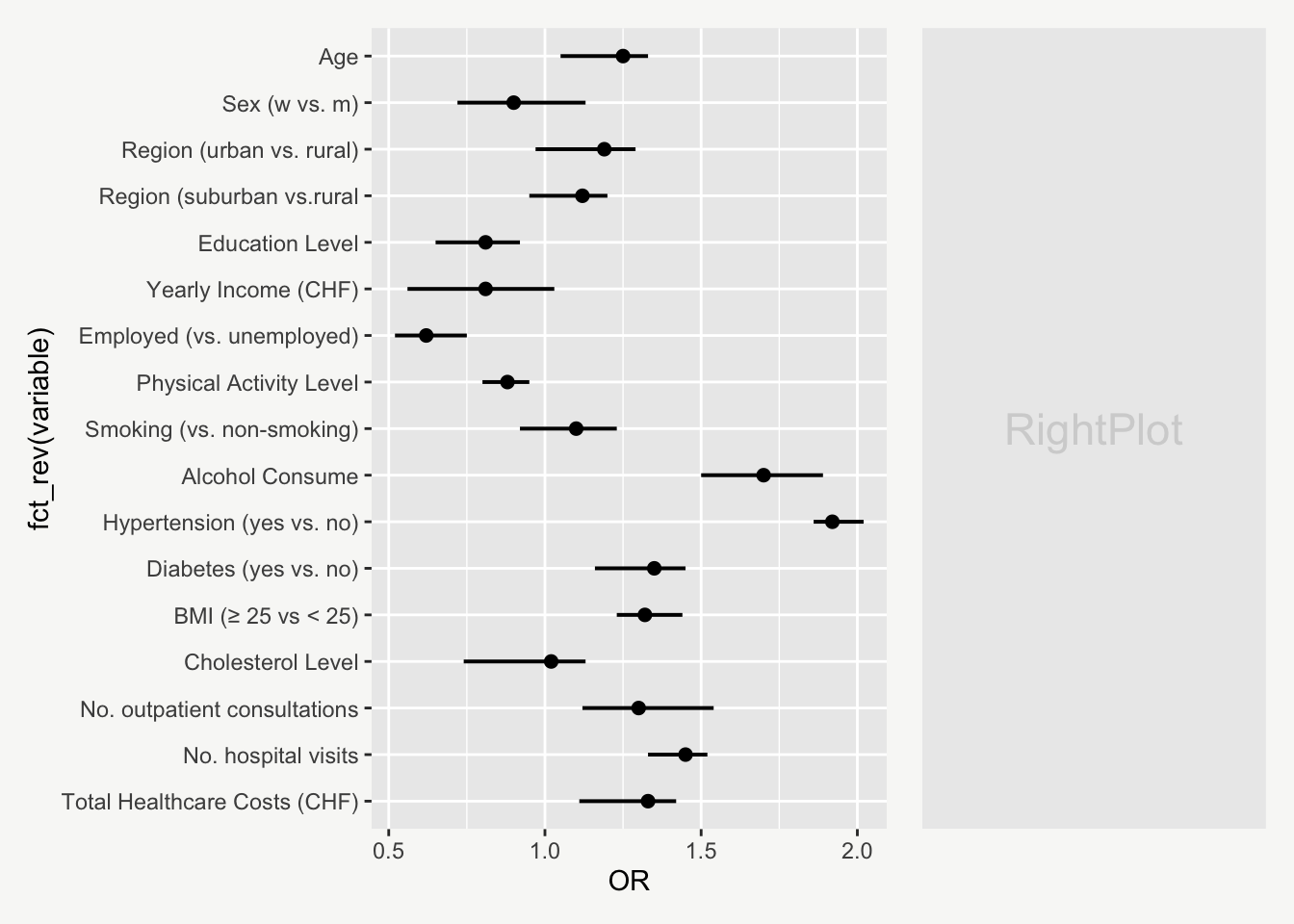
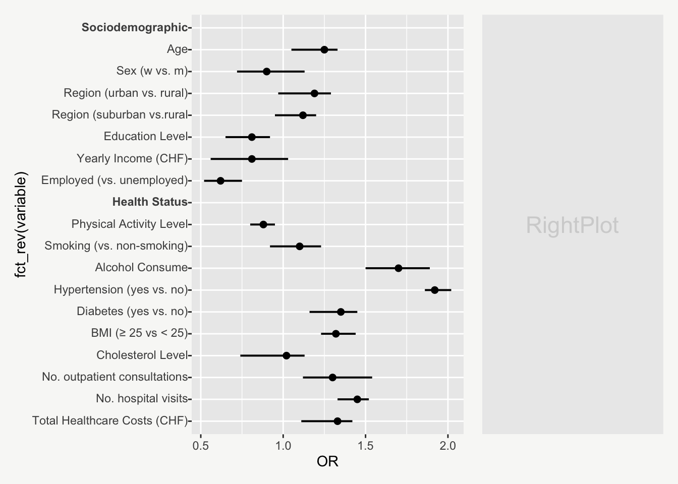
height = 0.0, linewidth = 0.70)Rather than displaying variables in alphabetical order, it would be more intuitive to group them logically — e.g. with sociodemographic variables appearing at the top, followed by health variables below.
To reorder the variables, I converted them into an ordered factor with new labels (see data preparation code) and used fct_rev() from {forcats} to reverse their order on the plot.
mainPlot <-

  ggplot(data, aes(y = fct_rev(variable), x = OR)) +
    geom_point(size=2, show.legend = F) +
    geom_errorbarh(aes(xmin=`CI_lower`, xmax=`CI_upper`),
                   height = 0.0, size = 0.70)
To enhance the plot’s structure, we can add subtitles that categorize the variable types — Sociodemographic and Health Status (see data preparation).
The subtitles can be formatted in bold by wrapping the text with **...** and using element_markdown() from {ggtext}.
mainPlot <-
ggplot(data, aes(y = fct_rev(variable), x = OR)) +
geom_point(size=2, show.legend = F) +
geom_errorbarh(aes(xmin=`CI_lower`, xmax=`CI_upper`),
height = 0.0, size = 0.70) +
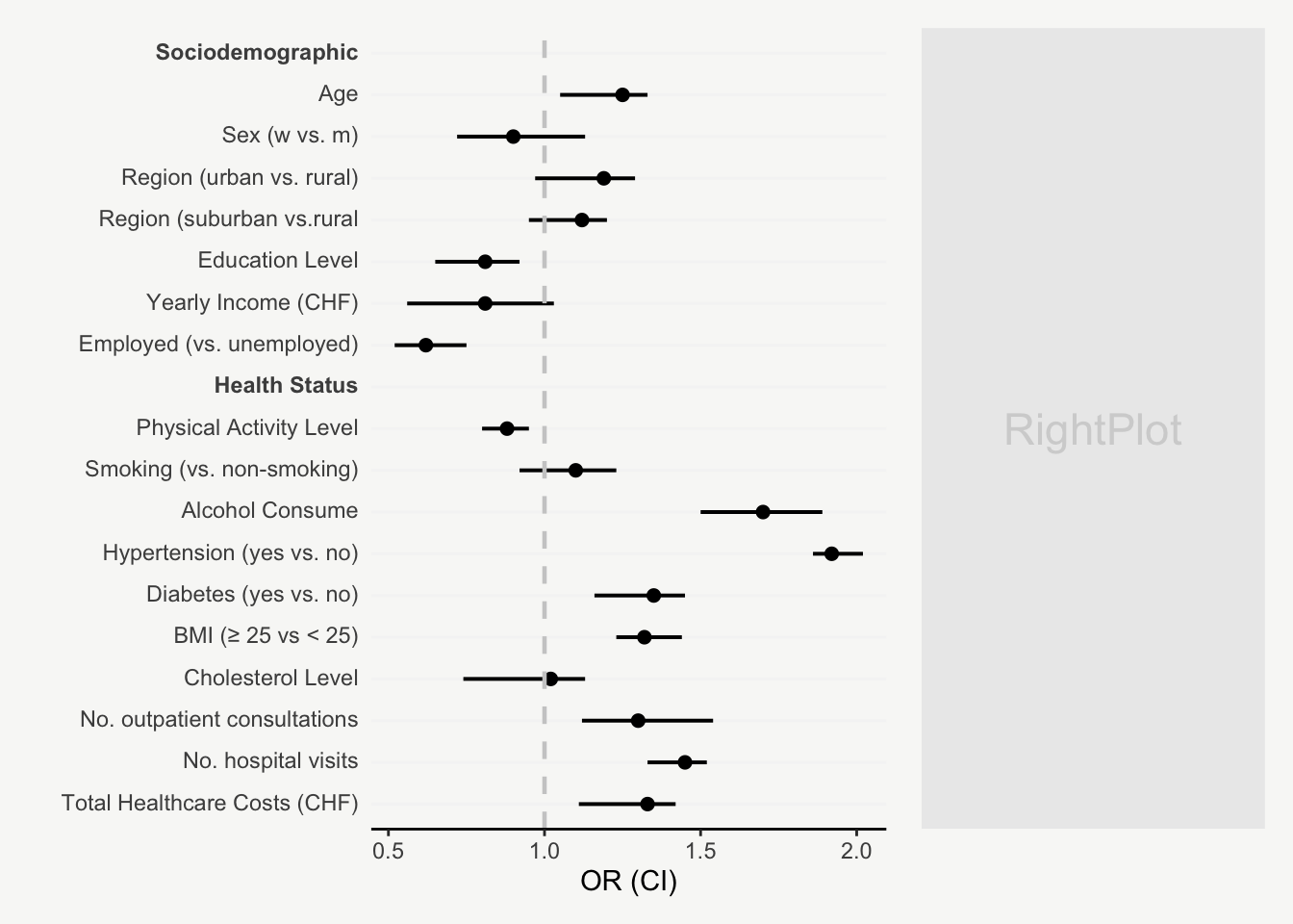
theme(axis.text.y = ggtext::element_markdown())Next, let’s make our main plot look a bit more polished…
mainPlot <-

  ggplot(data, aes(y = fct_rev(variable), x = OR)) +
    geom_point(size=2, show.legend = F) +
    geom_errorbarh(aes(xmin=`CI_lower`, xmax=`CI_upper`),
                   height = 0.0, size = 0.70) +
    labs(x = 'OR (CI)', y = '') +
    theme_classic() +
    theme(axis.text.y = ggtext::element_markdown(),
          axis.line.y = element_blank(),
          axis.ticks.y = element_blank(),
          panel.grid.minor.y = element_blank(),
          panel.grid.major.y = element_line(color = '#F5F5F5'),
          legend.position = 'none')
… and add a vertical reference line at OR = 1 to support visual interpretation.
mainPlot <-
ggplot(data, aes(y = fct_rev(variable), x = OR)) +
geom_point(size=2, show.legend = F) +
geom_errorbarh(aes(xmin=`CI_lower`, xmax=`CI_upper`),
height = 0.0, size = 0.70) +
geom_vline(aes(xintercept = 1),
color = 'grey80', lty = 2, size = 0.8) +
labs(x = 'OR (CI)', y = '') +
theme_classic() +
theme(axis.text.y = ggtext::element_markdown(),
axis.line.y = element_blank(),
axis.ticks.y = element_blank(),
panel.grid.minor.y = element_blank(),
panel.grid.major.y = element_line(color = '#F5F5F5'),
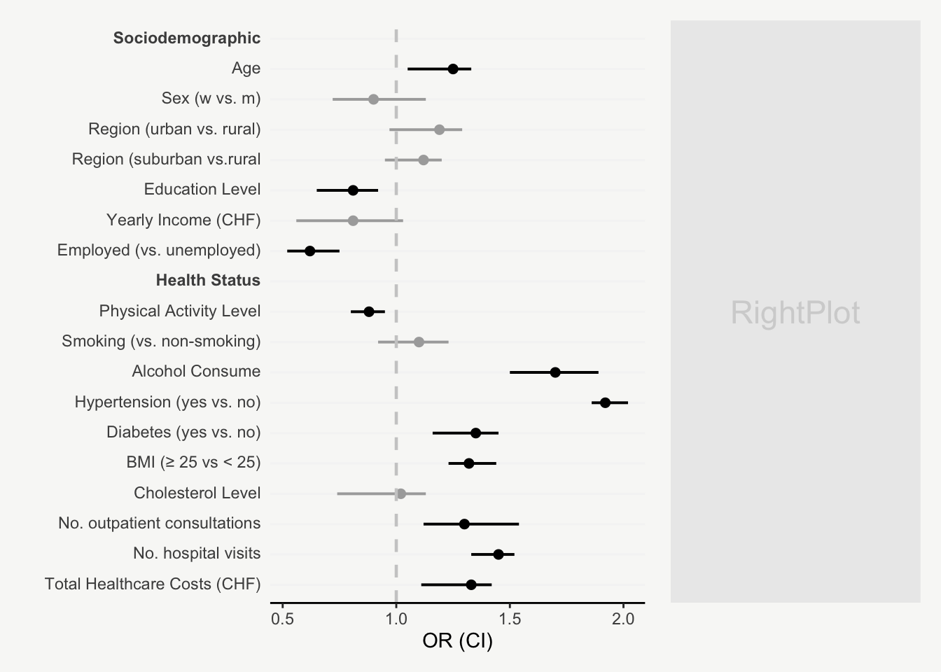
legend.position = 'none')Finally, points and error-bars can be colored based on the p-value significance level, using the p_value_sign variable (see data preparation).
mainPlot <-
ggplot(data, aes(y = fct_rev(variable), x = OR,
color = p_value_sign)) +
geom_point(size=2, show.legend = F) +
geom_errorbarh(aes(xmin=`CI_lower`, xmax=`CI_upper`),
height = 0.0, size = 0.70) +
geom_vline(aes(xintercept = 1),
color = 'grey80', lty = 2, size = 0.8) +
scale_color_manual(values = c("#aaaaaa", "black")) +
labs(x = 'OR (CI)', y = '') +
theme_classic() +
theme(axis.text.y = ggtext::element_markdown(),
axis.line.y = element_blank(),
axis.ticks.y = element_blank(),
panel.grid.minor.y = element_blank(),
panel.grid.major.y = element_line(color = '#F5F5F5'),
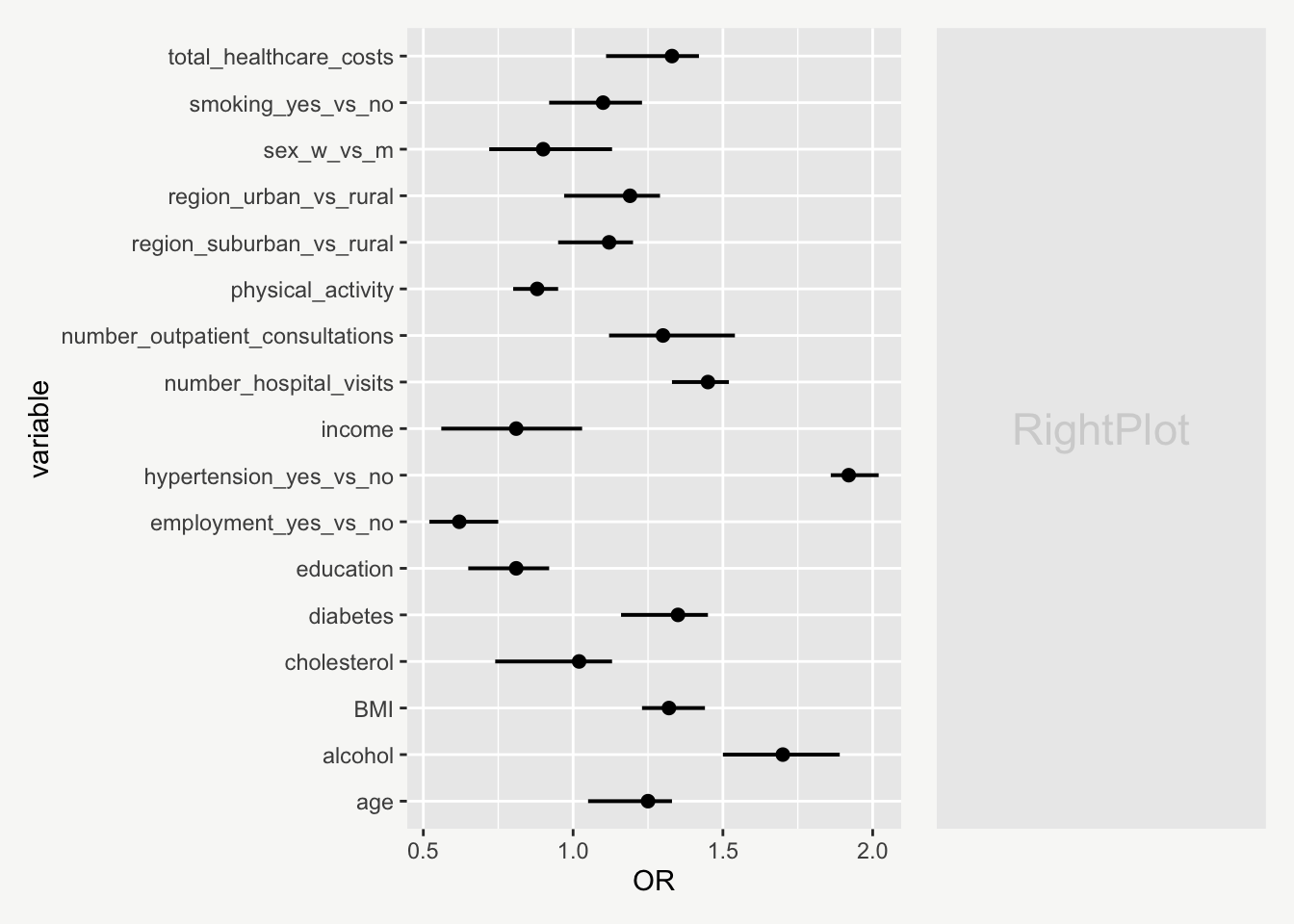
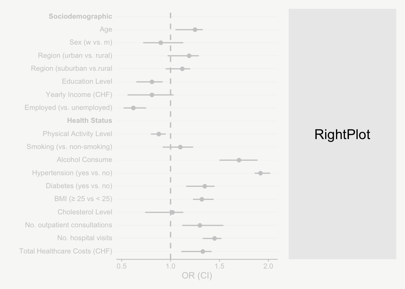
legend.position = 'none')Creating the Right Panel
Now let’s focus on the right side of the plot…
First, let’s plot the coefficients (OR and CI) and p-values as text. Looks horrible 😵.
rightPlot <-

  ggplot(data, aes(y = fct_rev(variable))) +
    geom_text(aes(x = 0, label = OR_CI), size = 3, hjust = 0) +
    geom_text(aes(x = 0.5, label = p_value_cat), size = 3, hjust = 1)
Remove axes, labels and grid lines. Much better 🤓.
rightPlot <-

  ggplot(data, aes(y = fct_rev(variable))) +
    geom_text(aes(x = 0, label = OR_CI), size = 3, hjust = 0) +
    geom_text(aes(x = 0.5, label = p_value_cat), size = 3, hjust = 1) +
    theme_void() +
    theme(legend.position = 'none')
Next, let’s also color-code the coefficients and p-values based on significance level. To make significant p-values stand out, I’ve used geom_richtext() from {ggtext} to display them in bold.
rightPlot <-
ggplot(data, aes(y = fct_rev(variable))) +
geom_text(aes(x = 0, label = OR_CI,
color = p_value_sign),
size = 3, hjust = 0) +
geom_richtext(aes(x = 0.5,
label = ifelse(is.na(p_value_cat), NA,
paste0('**', p_value_cat, '**')),
label.colour = NA,
color = p_value_sign), size = 3, hjust = 1) +
scale_color_manual(values = c("#aaaaaa", "black")) +
theme_void() +
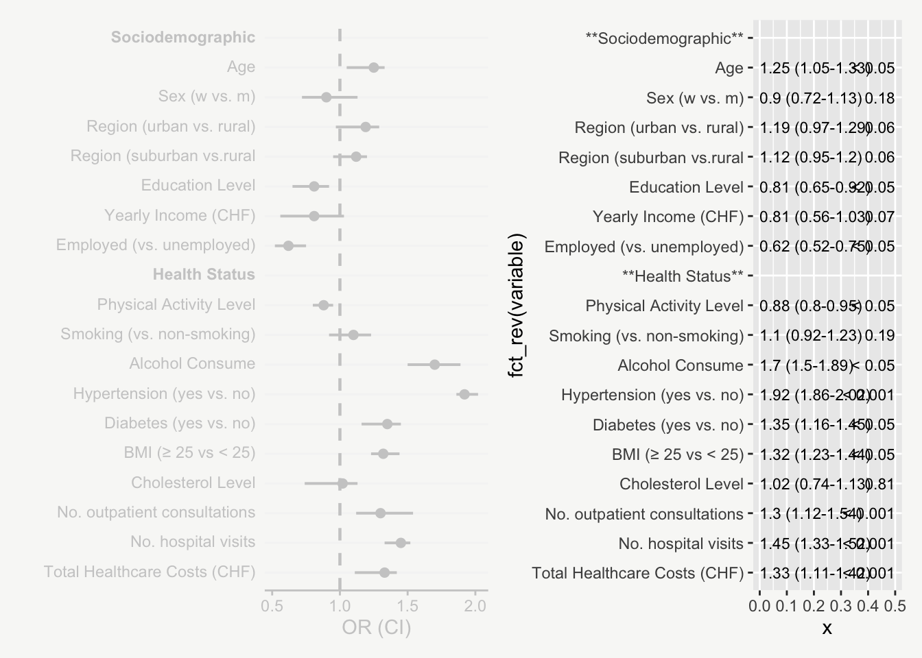
theme(legend.position = 'none')Let’s add titles for the OR (CI) and p-value columns. coord_cartesian() helps to adjust the y-axis limits so that the titles are positioned nicely within the plot.
rightPlot <-

  ggplot(data, aes(y = fct_rev(variable))) +
    geom_text(aes(x = 0, label = OR_CI,
                  color = p_value_sign),
              size = 3, hjust = 0) +
    geom_richtext(aes(x = 0.5,
                      label = ifelse(is.na(p_value_cat), NA,
                                     paste0('**', p_value_cat, '**')),
                      label.colour = NA,
                      color = p_value_sign), size = 3, hjust = 1) +
    scale_color_manual(values = c("#aaaaaa", "black")) +
    annotate('text', x = 0.04, y = dim(data)[1]+1,
             label = "OR (CI)", hjust = 0, fontface = "bold") +
    annotate('text', x = 0.5, y = dim(data)[1]+1,
             label = "p-value", hjust = 1, fontface = "bold") +
    coord_cartesian(ylim = c(1, dim(data)[1]+1) , xlim = c(0, 0.51)) +
    theme_void() +
    theme(legend.position = 'none')
Final Plot
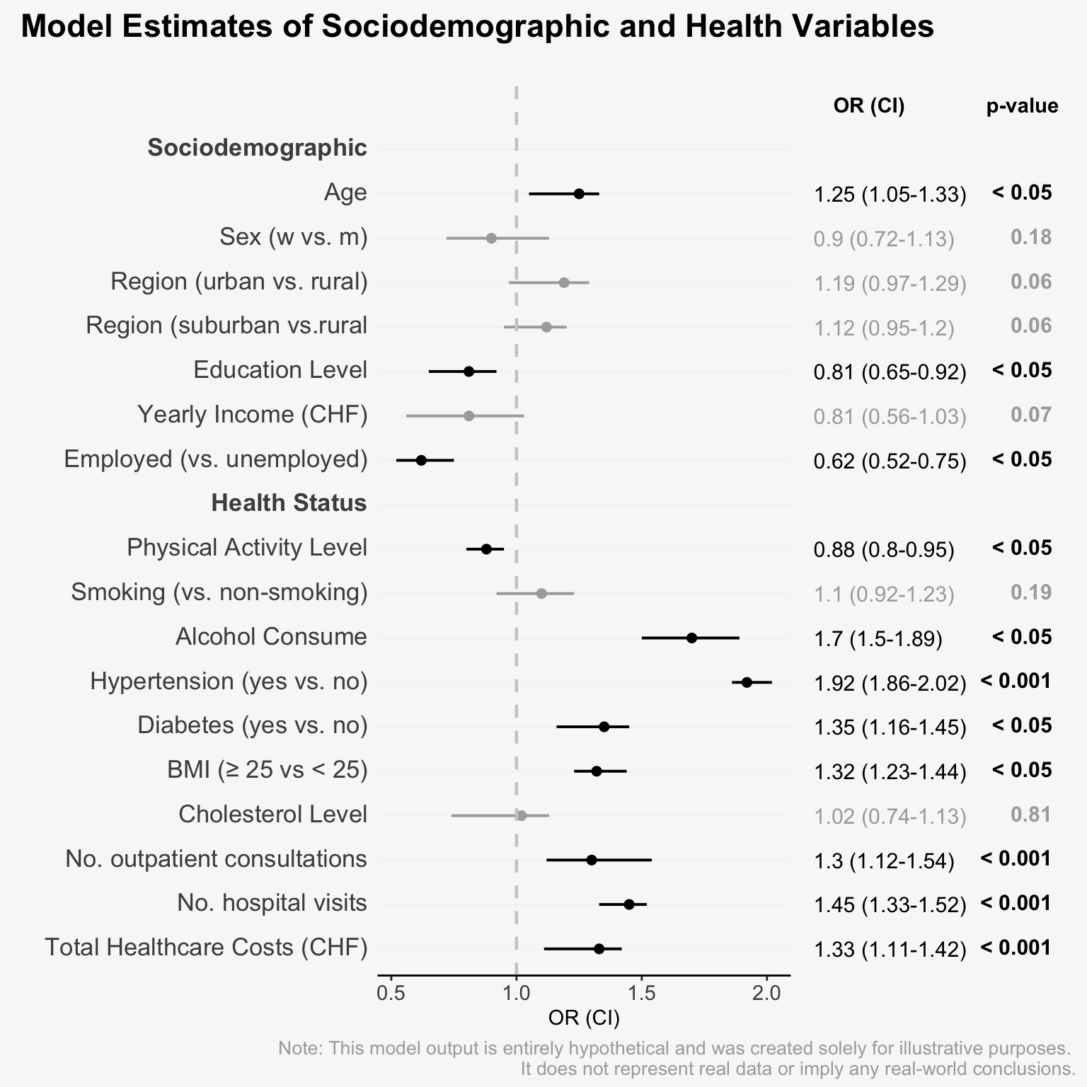
Let’s make sure the y-axes of both plots are aligned so they’re at exactly the same height, using the same coord_cartesian() setting in both the main plot and right plot.
mainPlot <-

 mainPlot +
    coord_cartesian(ylim = c(1, dim(data)[1]+1))
To finalize, let’s add some annotation using {patchwork}.
mainPlot + rightPlot + plot_layout(widths = c(1.8,1.2)) +
  plot_annotation(
    title = 'Model Estimates of Sociodemographic and Health Variables',
    caption = 'Note: This model output is entirely hypothetical and was created solely for illustrative purposes.
    It does not represent real data or imply any real-world conclusions.'
  )


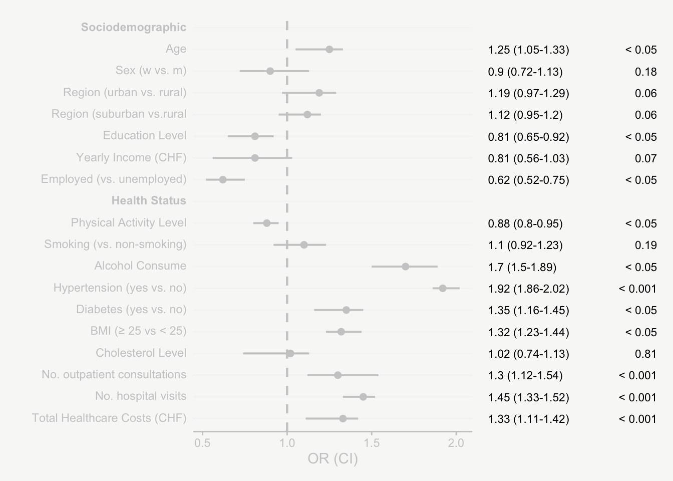
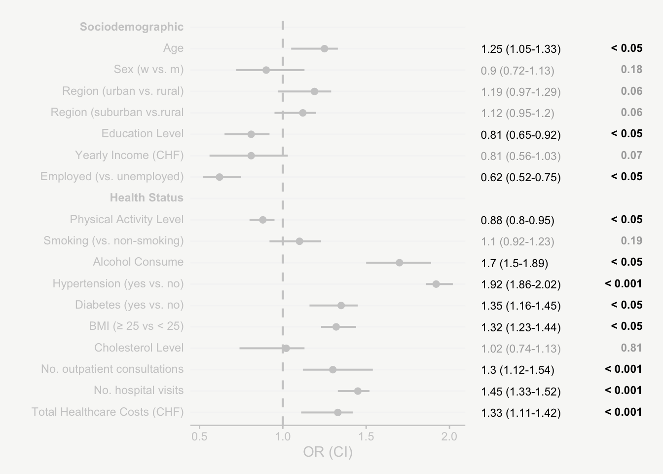
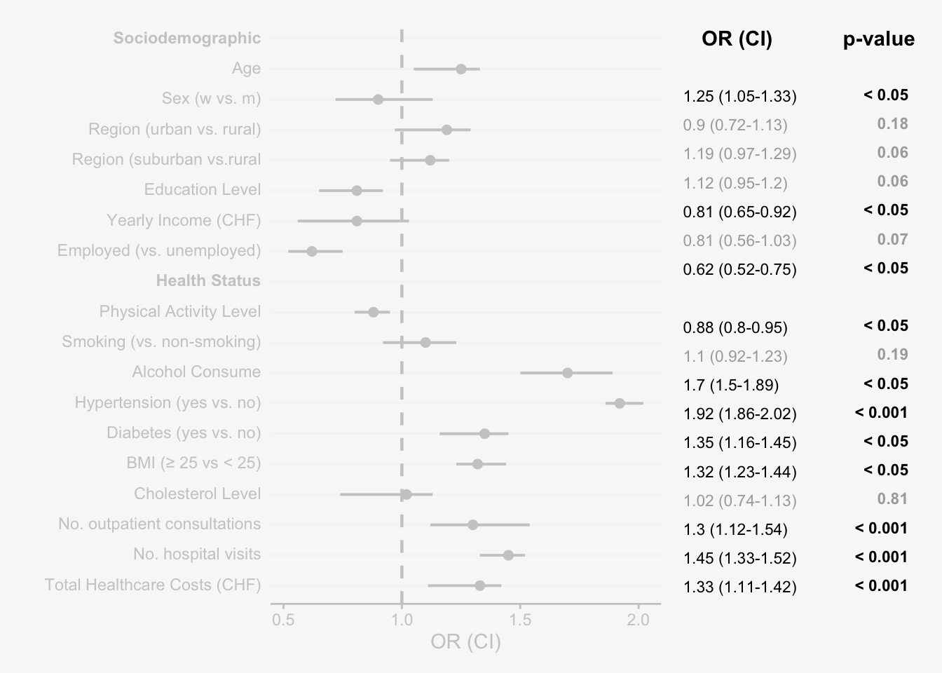
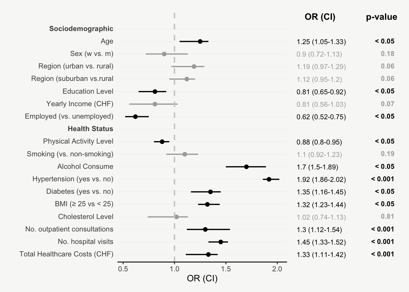
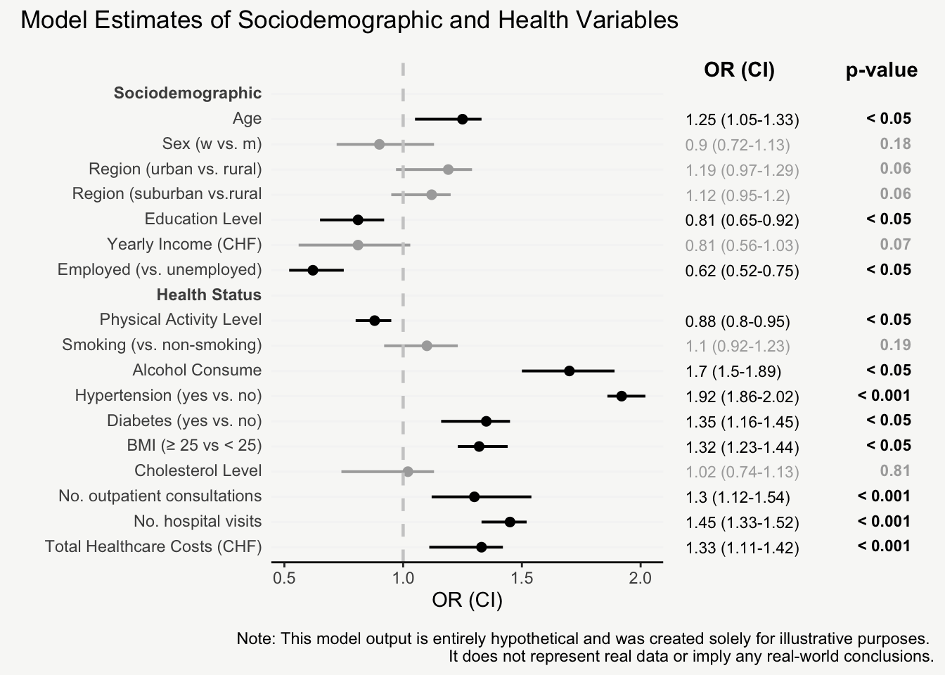
That’s it! Now we have an informative plot of model estimates with odds ratios, confidence intervals, and p-values - all nicely formatted and aligned.
Here you find the complete code:
R code: data
# library(R.utils)
# library(tidyverse)

model_data <- function() {

# ----------------------------- generate data ----------------------------------
data.original <- data.frame(

  variable = c(
    "age",
    "sex_w_vs_m",
    "region_urban_vs_rural",
    "region_suburban_vs_rural",
    "education",
    "income",
    "employment_yes_vs_no",
    "smoking_yes_vs_no",
    "alcohol",
    "hypertension_yes_vs_no",
    "diabetes",
    "BMI",
    "physical_activity",
    "cholesterol",
    "total_healthcare_costs",
    "number_hospital_visits",
    "number_outpatient_consultations"
  ),
  OR = c(
    1.25, 0.9, 1.19, 1.12, 0.81, 0.81, 0.62, 1.1,
    1.70, 1.92, 1.35, 1.32, 0.88, 1.02, 1.33,
    1.45, 1.30
  ),
  CI_lower = c(
    1.05, 0.72, 0.97, 0.95, 0.65, 0.56, 0.52, 0.92,
    1.50, 1.86, 1.16, 1.23, 0.80, 0.74, 1.11,
    1.33, 1.12
  ),
  CI_upper = c(
    1.33, 1.13, 1.29, 1.20, 0.92, 1.03, 0.75, 1.23,
    1.89, 2.02, 1.45, 1.44, 0.95, 1.13, 1.42,
    1.52, 1.54
  ),
  p_value = c(
    0.011, 0.18, 0.062, 0.062, 0.009, 0.073, 0.002, 0.19,
    0.001, 0.0001, 0.004, 0.013, 0.021, 0.81, 0.0003,
    0.00001, 0.0007
  ))


# ------------------------ add plot specific variables -------------------------

data.original <-

  data.original |>
  mutate(
    type = c(rep("Sociodemographic", 7),
             rep("Health Status", 10)),
    OR_CI = paste0(round(OR, 2), ' (',
                   round(CI_lower, 2), '-', round(CI_upper, 2),
                   ')'),
    p_value_sign = ifelse(p_value < 0.05, TRUE, FALSE),
    p_value_cat = case_when(p_value < 0.001 ~ '< 0.001',
                            p_value < 0.05 ~ '< 0.05',
                            TRUE ~ as.character(round(p_value, 2))
    )
  )


# ----------------------------- order variables --------------------------------

data.ordered <- data.original |>
  mutate(variable = factor(variable,
                           levels = c("age", "sex_w_vs_m",
                                      "region_urban_vs_rural",
                                      "region_suburban_vs_rural",
                                      "education",
                                      "income",
                                      "employment_yes_vs_no",
                                      "physical_activity",
                                      "smoking_yes_vs_no",
                                      "alcohol",
                                      "hypertension_yes_vs_no",
                                      "diabetes",
                                      "BMI",
                                      "cholesterol",
                                      "number_outpatient_consultations",
                                      "number_hospital_visits",
                                      "total_healthcare_costs"),
                           labels = c("Age", "Sex (w vs. m)",
                                      "Region (urban vs. rural)",
                                      "Region (suburban vs.rural",
                                      "Education Level",
                                      "Yearly Income (CHF)",
                                      "Employed (vs. unemployed)",
                                      "Physical Activity Level",
                                      "Smoking (vs. non-smoking)",
                                      "Alcohol Consume",
                                      "Hypertension (yes vs. no)",
                                      "Diabetes (yes vs. no)",
                                      "BMI (≥ 25 vs < 25)",
                                      "Cholesterol Level",
                                      "No. outpatient consultations",
                                      "No. hospital visits",
                                      "Total Healthcare Costs (CHF)")
  )
  )


# ----------------------------- add subtitles ----------------------------------

orig_levels <- levels(data.ordered$variable)
new_levels <- insert(orig_levels, ats = c(1, 8),
                     values = c("**Sociodemographic**", "**Health Status**"))


data <- data.ordered |>
  group_by(type) |>
  group_modify(~ add_row(.x, .before = 0)) |>
  ungroup() |>
  mutate(variable = ifelse(is.na(variable),
                           paste0("**",type, "**"), as.character(variable))) |>
  mutate(variable = factor(variable,
                           levels = new_levels,
                           labels = new_levels
  )
  )

# ----------------------------- return data ------------------------------------

 return(
   list(
    data.final = data,
    data.original = data.original,
    data.ordered = data.ordered
 )
 )
}


# Example usage
# data <- model_data()$data.final
R code: plot
# library(ggplot2)
# library(patchwork)
# library(ggtext)
# library(tidyverse)


model_plot <- function(data){

mainPlot <- # -----------------------------------------------------------------

  ggplot(data, aes(y = fct_rev(variable), x = OR, color = p_value_sign)) +
  geom_point(size=2, show.legend = F) +
  geom_errorbarh(aes(xmin=`CI_lower`, xmax=`CI_upper`),
                 height = 0.0, size = 0.70) +
  geom_vline(aes(xintercept = 1),
             color = 'grey80', lty = 2, size = 0.8) +
  scale_color_manual(values = c("#aaaaaa", "black")) +
  coord_cartesian(ylim = c(1, dim(data)[1]+1)) +
  labs(x = 'OR (CI)', y = '') +
  theme_classic() +
  theme(legend.position = 'none',
        axis.line.y = element_blank(),
        axis.ticks.y = element_blank(),
        axis.text.y = ggtext::element_markdown(size = 13),
        axis.text.x = element_text(size = 11),
        panel.grid.minor.y = element_blank(),
        panel.grid.major.y = element_line(color = '#F5F5F5'),
        panel.background = element_rect(fill = "#f8f8f6", color = NA),
        plot.background = element_rect(fill = "#f8f8f6", color = NA))


rightPlot <- # -----------------------------------------------------------------

ggplot(data, aes(y = fct_rev(variable))) +
  geom_text(aes(x = 0, label = OR_CI, color = p_value_sign),
            size = 4, hjust = 0) +
  geom_richtext(aes(x = 0.5,
                    label = ifelse(is.na(p_value_cat), NA,
                                   paste0('**', p_value_cat, '**')),
                    label.colour = NA, color = p_value_sign),
                fill = NA, size = 4, hjust = 1) +
  annotate('text', x = 0.04, y = dim(data)[1]+1,
           label = "OR (CI)", hjust = 0, fontface = "bold") +
  annotate('text', x = 0.5, y = dim(data)[1]+1,
           label = "p-value", hjust = 1, fontface = "bold") +
  scale_color_manual(values = c("#aaaaaa", "black")) +
  coord_cartesian(ylim = c(1, dim(data)[1]+1), xlim = c(0, 0.51)) +
  theme_void() +
  theme(legend.position = 'none')


# ----------------------- combined plots & annotations -------------------------

mainPlot + rightPlot + plot_layout(widths = c(1.8,1.2)) +
  plot_annotation(
    title = 'Model Estimates of Sociodemographic and Health Variables',
    subtitle = '',
    caption = 'Note: This model output is entirely hypothetical and was created solely for illustrative purposes.
    It does not represent real data or imply any real-world conclusions.',
    theme = theme(plot.title = element_text(size = 17, face = "bold", hjust = 0),
                  plot.subtitle = element_text(size = 16, hjust = 0),
                  plot.caption = element_text(size = 10, hjust = 1, color = '#aaaaaa'))
  )
}

# Example usage:
# model_plot(data = data)